from  WinCustomize Forums
Dreamed this up last night, more to follow....
..lots more... 
Subject to change*


Dreamed this up last night, more to follow....
..lots more...
Subject to change*
Latest screenies looking real goooooooooooooooood John! 
EDIT: fixed 

Fixed... 
Thanks for the insight. I especially appreciate how the lighting gives it a very definite sense of environment and atmostphere, a sense of place. To me, great skins and themes are all about immersion. Your approach to Andromeda, Penthouse, et al exemplifies this. I'm not great with graphics, so I learn a lot from quietly watching WIP threads like this and others, little things like adding a hint of blue to an otherwise flat gray and how much of a difference things like that make.
Anyhow, carry on. 
Oh yes, throwing about 10% blue to an otherwise 'browny' grey is a must for me anytime I do anything grey\dark.
Thanks for your input, and if you ever need any help, I'm always around (unless I take a 3 month break)
Lurk on! 
Still willing to do some dockage John. No rush, but could I have a current PSD to work off of?
Yes, you may, and you get double points for ... Off..of.
stand by. 
(The unfortunate side to working off a PSD that has the main layer flattened and brushed is.. you have to work off a PSD that has the main layer flattened and brushed) 
Here you go.. http://www.sendspace.com/file/zozny3 The included WB is XP only, half ass finished..
WB Updated for everyone else too. (includes scrollbars)
Don't click the wrong link. 
Oops! 

This WB looks stunning! And that's that I'm running the XP version on 7!
(Do I also get dougle points for "that's that"?)
Nope.. one point deduction for.. 'Dougle" 

Sliders and checkboxes and completed shellstyle XP.

Absolutely fantastic John! 
Damn nice scrollbars!!!
Damn nice everything!! 
Damn nice........crap.......late again as usual. 
Looking very good vStyler.
Loving the borders/scrollbars, but the lighting on the tool/menu bars kinda bom me out.....
Will there be a 'flattened' single color version where...

I'll be grabbing it no matter what, though. 
U know, you just solved a problem all XP skins with gradients have.. when you re-size any window with a toolbar containing textures or gradients it creates remnants along the dividing lines. There absolutely nothing that the skinner can do about it. Always been a bug , always will be, unless Neil delves back into XP to remedy it.
So.. simple solution.. a flat toolbar\statusbar sub-style., easy enough, two images replaced, wham bam, bobs ur uncle.
Of course some people.. may also appreciate the choice.
Great suggestion...
Everyone else, thanks too 
Loving this!! Can't wait to see it finished. 
Start button.. and no, I wont be doing a winflag version.

This is working out better than expected. Looking forward to the finished product.
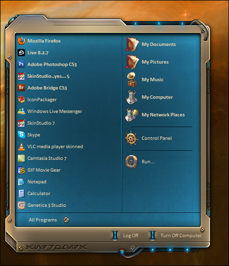
Gettin there... Dont forget to zoom.
Enough for one day. 


Wow! This looks fantastic! Is there a way that I can be notified when it is available? Can't wait! 
Yeah, had that in mind myself.
Who needs a steenkin flag anyway....
Love the way it looks now!
What I expected Master vStyler has provided with exceptional aplomb. Classic Keeper. (That's a new gallery thingy I thinked up) 
Welcome Guest! Please take the time to register with us.